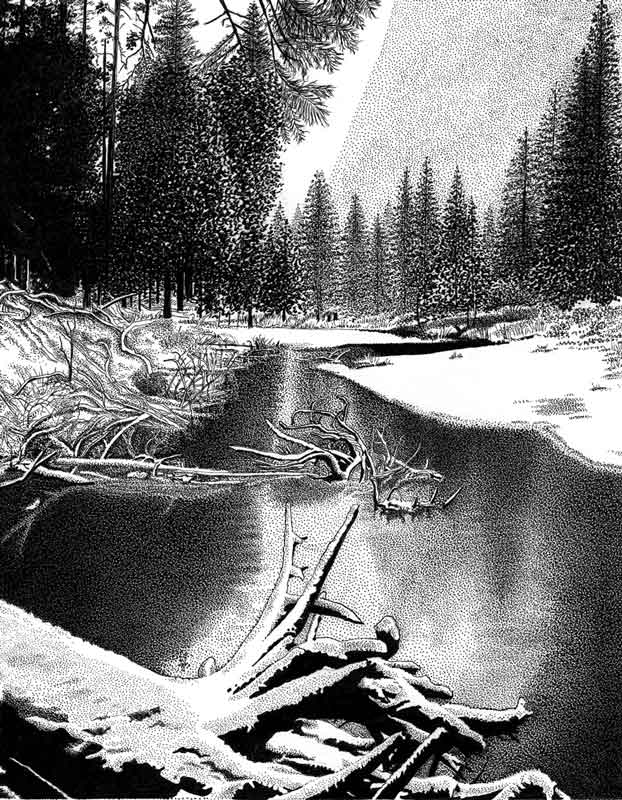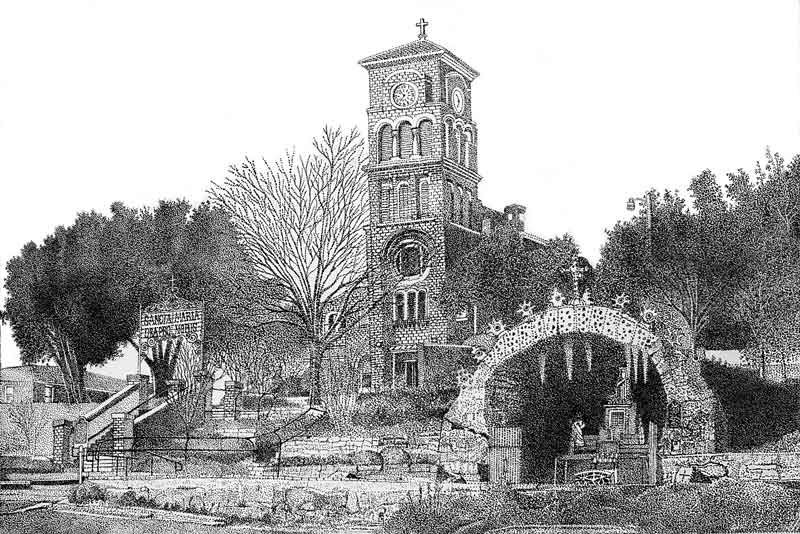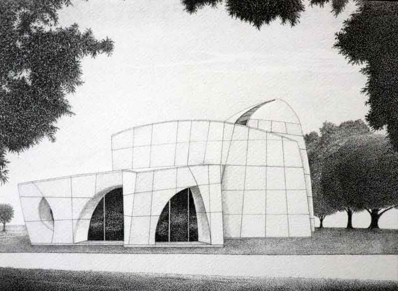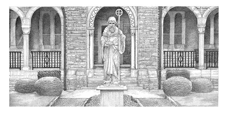
I have been doing pen and ink illustrations since 1988, but started perfecting the technique in 1994.
I started making sure that I took my time and made each dot perfectly round. There should never be any streaks or lazy dots. Each one should be made with intent, even if they are all overlapping. It resonates with a feeling of an organic visual, yet shows focus and control. It feels like, when does right, you can recreate the look of a photo because they are inherently made up of dots as well.
“I always start with a BW print of a photo sized 6″ x 8″ roughly. Then I begin to draw out all of the details in a light sketch on illustration board. Once the sketch in finished, I begin to add the dots. Each dot needs to be perfectly round so I need to always remember to not rush the process and only work a few hours at a time. The darker areas are dots on dots on dots. The sky is just dots that are closer or farther away from each other to create a nice, subtle, visual density and the illusion of clouds.”
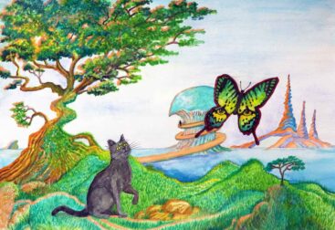
Each piece presented a new challenge in either the perspective, details and accuracy that I had to nail so they would resonate with visual authenticity.
If you are interested in an inscribed and signed print, check out my STORE. You can purchase all items for sale there.