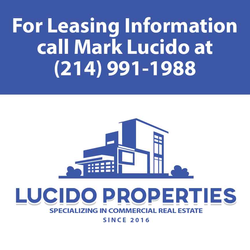
I was asked by my friend Mark Lucido I’ve known since high school to create a corporate logo for him and his company. He has operated the business for over 10 years yet has never had a “real” logo…until now.
He definitely wanted to use the color blue. I then suggested that we incorporate the letters L and P into the design, making it part of the building. That way, it is integrated into the design subliminally.
He was very happy with the final design and now not only is on his business card, but it is also on a giant sign advertising retail office space in business strip centers for his company.

The best part of this story is that the new logo is generating business and getting noticed! He is FINALLY a legitimate business with an identity that fully connects with his service offerings in a multi-dimensional way.
I love working with my clients to co-create branding and marketing graphics. We both work together to take their ideas and turn them into the best version of that they are thinking and make it bigger and cooler than they originally envisioned.


